


powered Enterprise Asset Management Platform.

UX/UI Design
Logo Design
Branding
Strategy
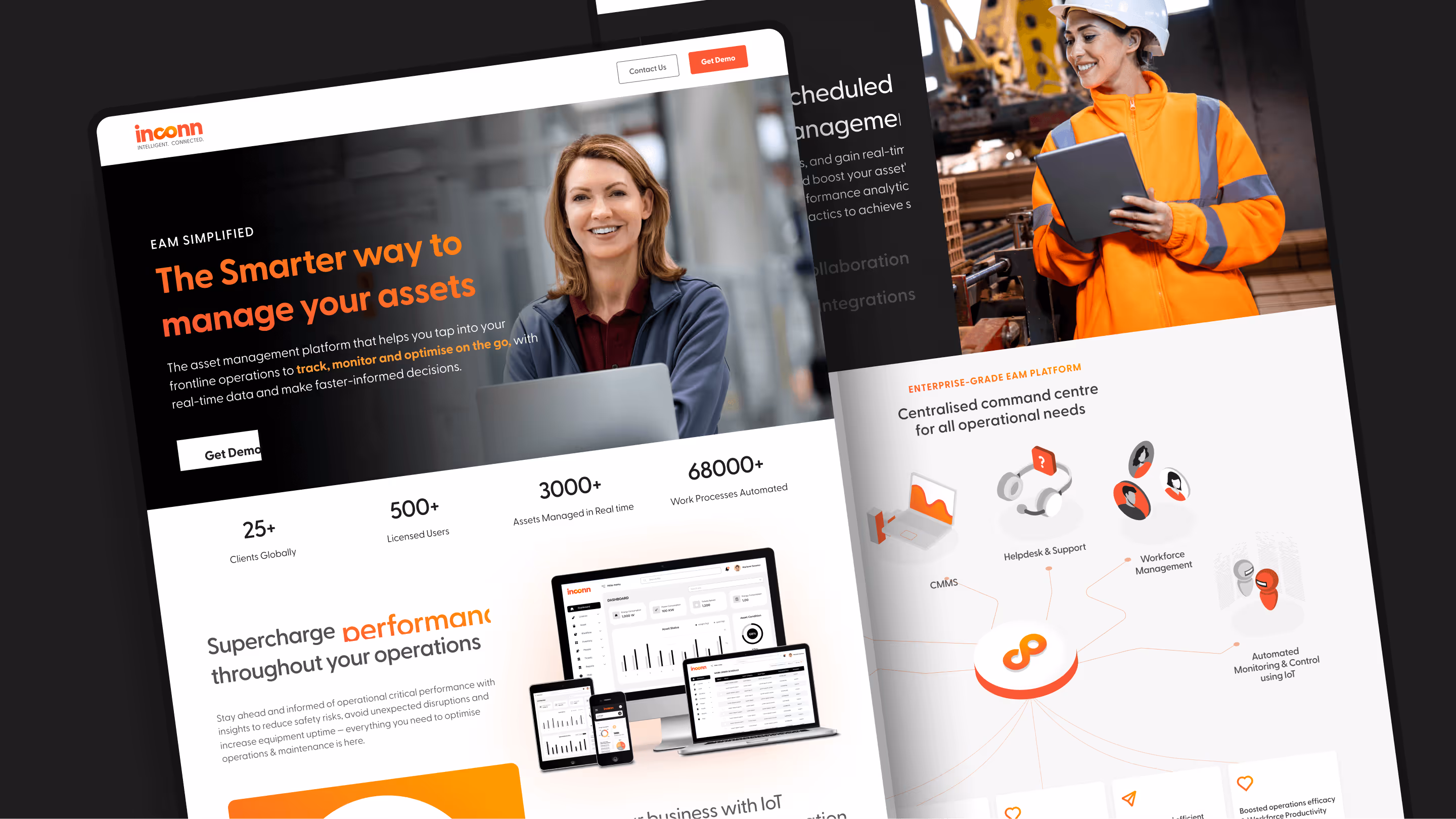
About Inconn
Inconn, a UDS subsidiary and a leader in integrated business services, offers a cloud-based Asset Operation Management system. With a mobile-first CMMS, EAM, and IoT suite, it streamlines operations, extends asset lifecycles, and transforms maintenance from preventive to predictive.
Customer
Inconn
Industry
Enterprise SaaS
Platforms Used
Figma, Adobe Illustrator

Overview
The Problems
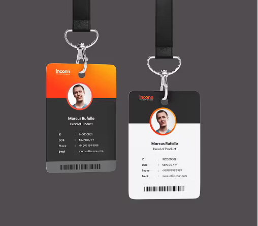
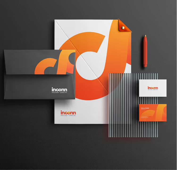
The Brand
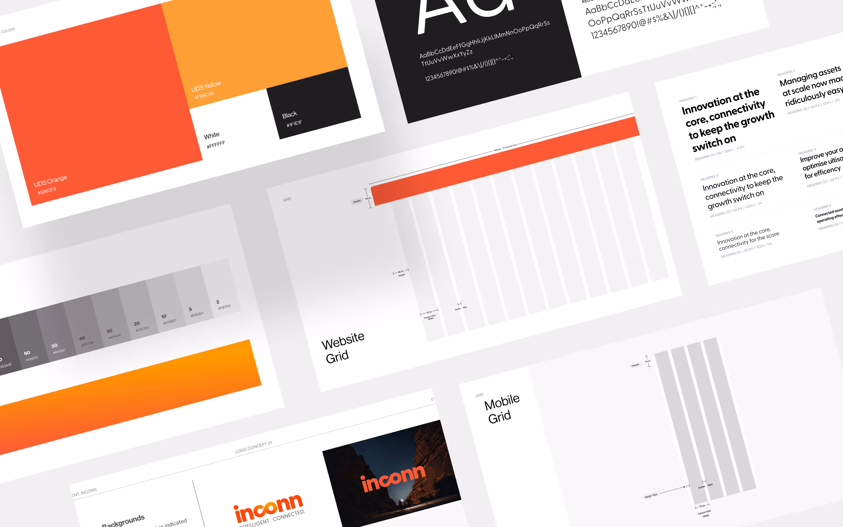
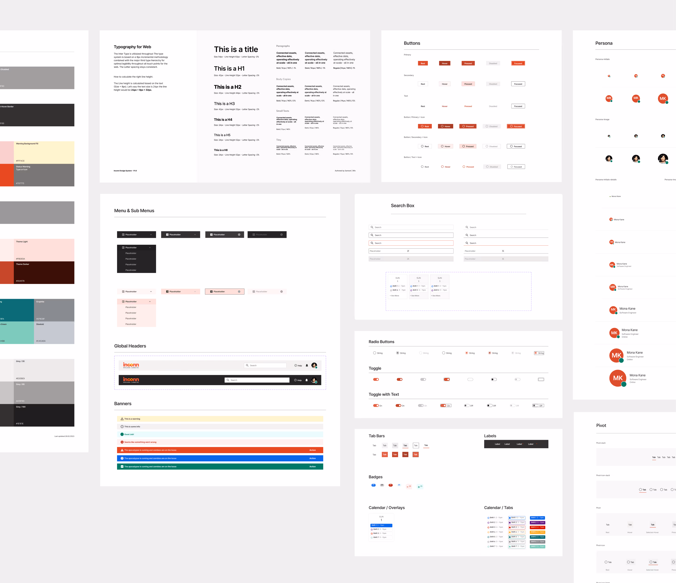
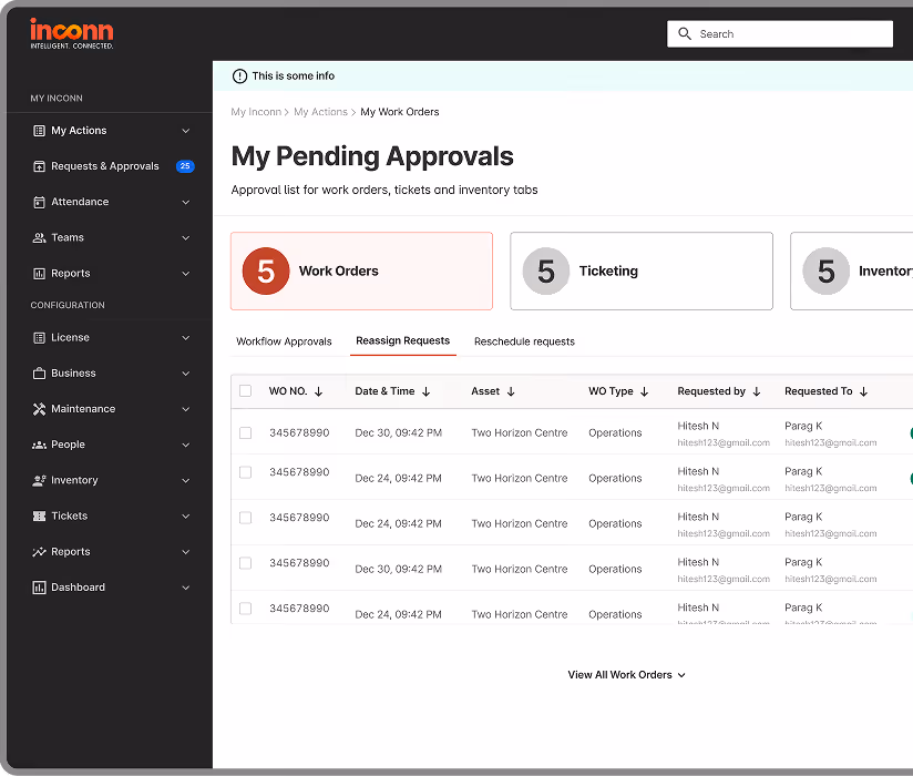
Defining the Brand Identity
We began by identifying and shaping the brand, starting with the logo. Through close collaboration with stakeholders, we swiftly refined the vision, ensuring a seamless connection across all touchpoints with a cohesive brand system.

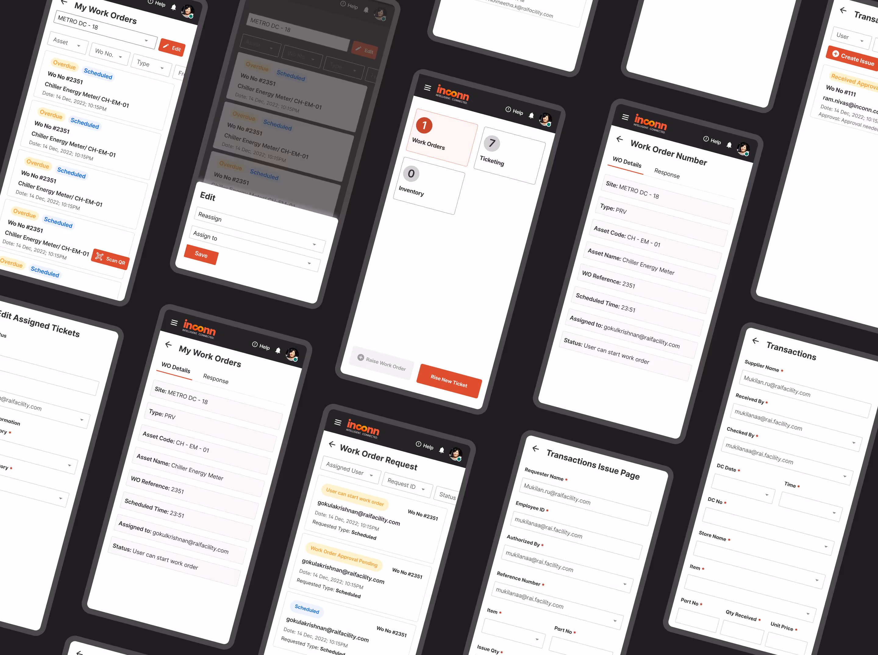
Low fidelity wireframes
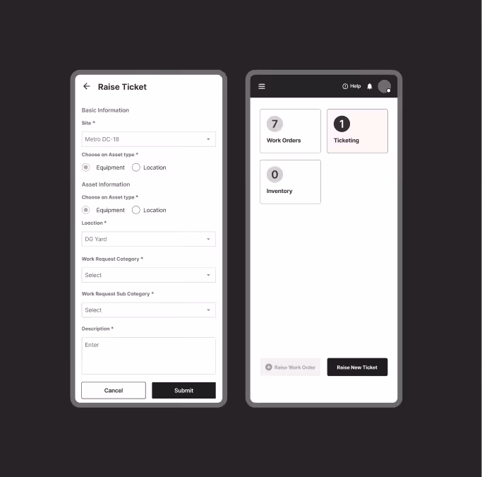
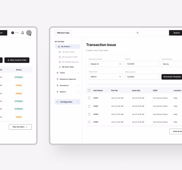
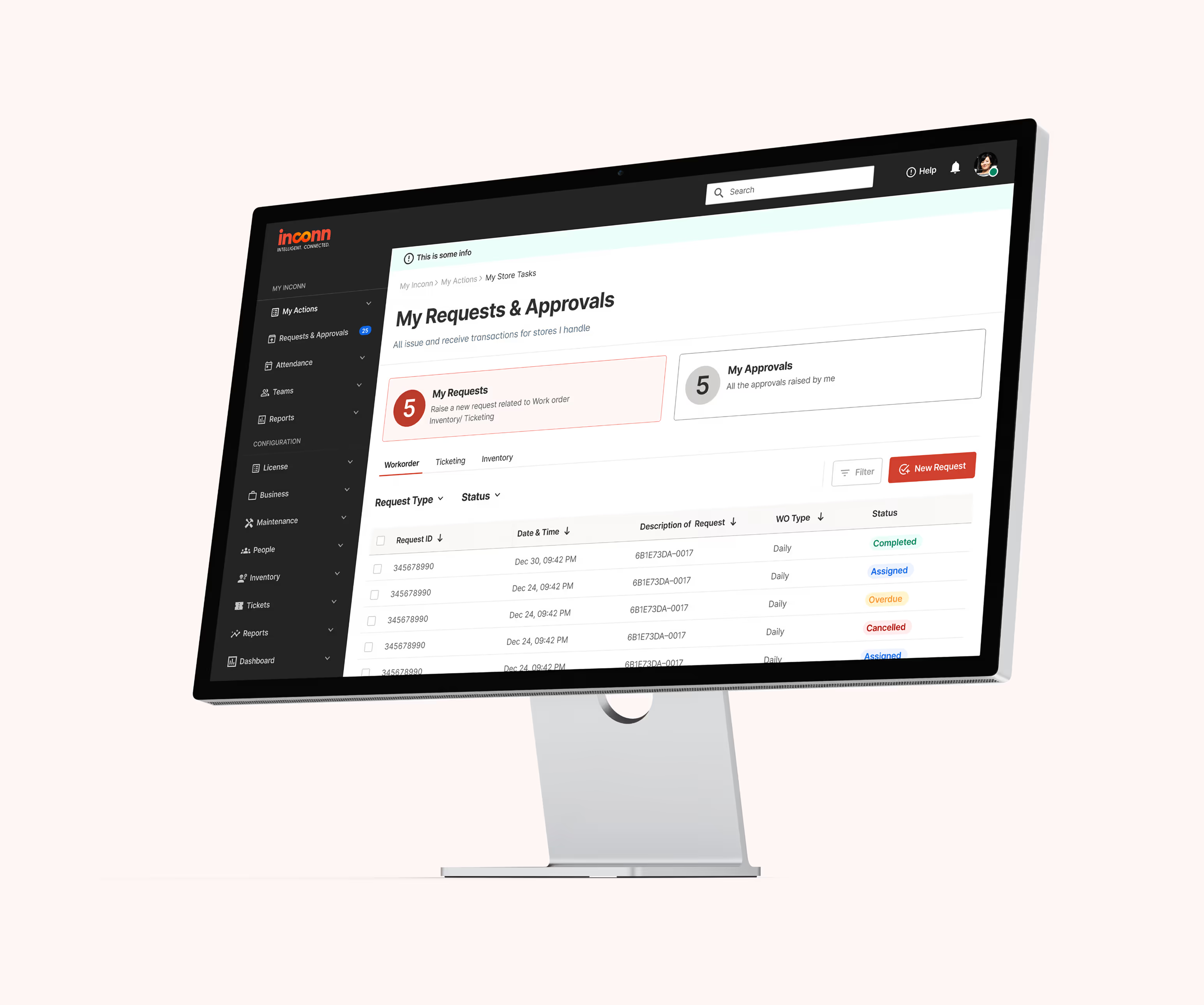
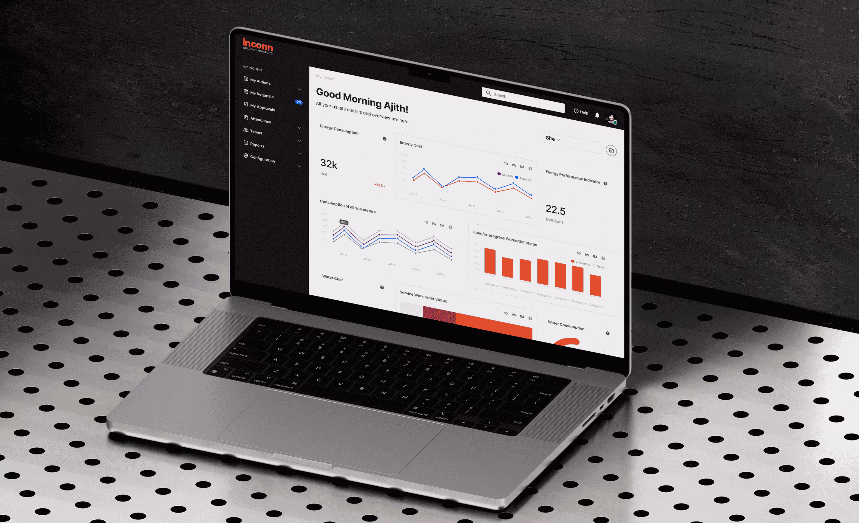
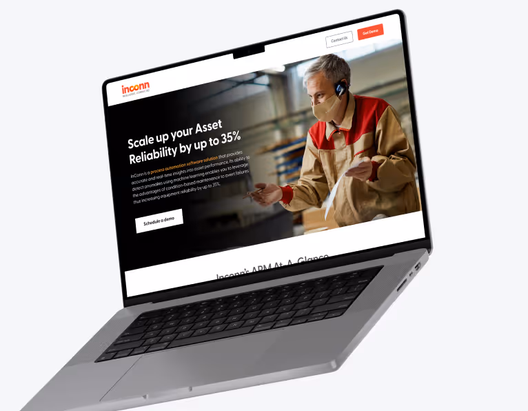
Visual design
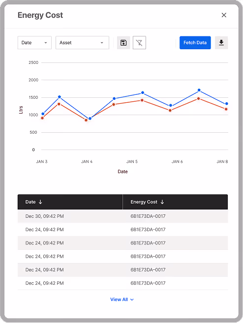
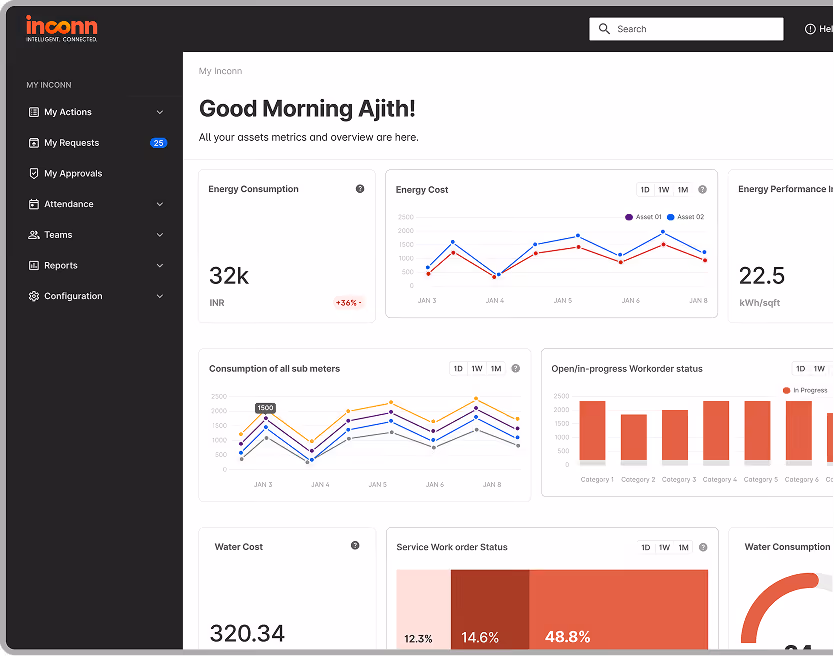
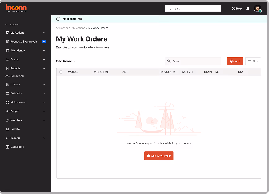
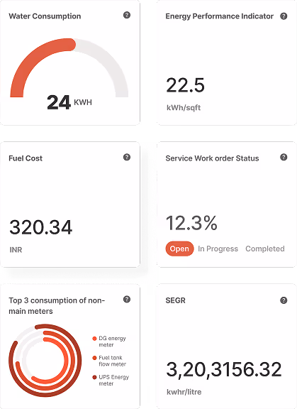
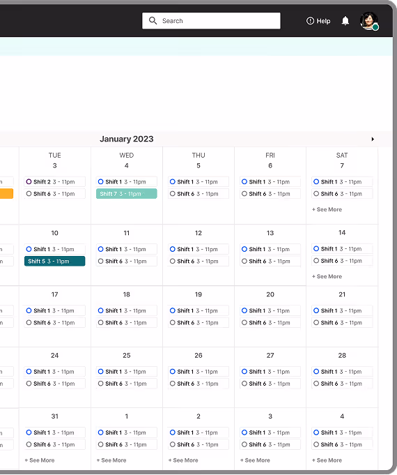
The Outcomes

.svg)
“Kensium (formerly 99x Studio) delivered consumer-focused branding and user-focused UX, resulting in a more intuitive platform, increased user satisfaction, streamlined production process, and decreased timelines by 20%. The Team demonstrated patience, proactive communication, timely delivery, and UI/UX knowledge.”
Explore More Case Studies


Integrating Shopify with ERP to increase revenues by 66% and improve inventory management while reducing labor costs.
SOLUTION
With the Shopify Connector, Acumatica was treated as the single source of truth for product data and especially inventory.
INDUSTRY
Holiday Decorations
VIEW CASE STUDY

Consistent double-digit revenue growth year-over-year, fueled by constant innovation in UX/UI, the launch of PWA-site.
SOLUTION
The new PWA based Magento site built by Kensium was able to bring down response times from 40+ seconds to under 4 seconds – even for complex pages.
INDUSTRY
Heating, Air Conditioning, D2C
VIEW CASE STUDY


Create superior customer experiences leading to improved CSAT and increased sales.
SOLUTION
North40 was able to maintain control over the entire customer experience and gather valuable data on consumer preferences.
INDUSTRY
Outdoor Goods, Retail
VIEW CASE STUDY
.png)


Increase Revenues, Gain Customer Loyalty, Improve inventory management, Reduce shipping and Labor costs.
SOLUTION
With Acumatica and its connection to Magento, AMI’s online orders now flow into the financial system in real- time.
INDUSTRY
Agriculture & Farming
VIEW CASE STUDY
.png)

Leveraging Progressive Web App and Adobe Commerce for explosive business growth.
SOLUTION
With the help of Kensium, Riddles was able to increase traffic, Conversion Rate as well as Average Order Value
INDUSTRY
Luxury Goods & Jewelry
VIEW CASE STUDY


.png)
A blazing star of Unified Commerce that leveraged Acumatica’s native functionality to connect Ecommerce website and scale the efficiencies to the next level.
SOLUTION
By transitioning to BigCommerce and Acumatica, YardBright immediately benefited from a modern, scalable platform.
INDUSTRY
Landscape Lighting
VIEW CASE STUDY
.png)


BigCommerce Multi Storefront with Acumatica integration – One integrated solution to manage all business operations including three Ecommerce websites
SOLUTION
All the initial goals at the beginning of the project were realized – including the single integrated system that allows Room One to manage all aspects of their business.
INDUSTRY
HVAC, Recommerce
VIEW CASE STUDY
.png)
.png)
Streamlined operations, effective inventory management and BigCommerce’s B2B capabilities to provide Franchise / marketplace capabilities for Sod.
SOLUTION
One key factor in SodStar’s success was its D2C model. This strategy was powered by cutting out traditional retail channels and selling directly to customers through its website and physical stores.
INDUSTRY
Agriculture and Farming
VIEW CASE STUDY
.png)
.png)
.png)
Fusing Commerce with Cause: Door County Candle’s Revenue Surge Powered by Kensium’s Shopify + ERP Solution.
SOLUTION
As a result of Kensium's work, DCC has not only been able to donate substantial sums to noble causes but has also seen a marked increase in sales.
INDUSTRY
Home Décor, Wellness
VIEW CASE STUDY
.png)
.png)

Fasttrack migration from WooCommerce to Shopify Plus with strong back-end ERP Integration.
SOLUTION
Kensium was able to launch a new Shopify website for 3DXTECH supporting B2C & B2B buyer journeys, integrated with Acumatica in under 3 months
INDUSTRY
3D Printing & Manufacturing
VIEW CASE STUDY
.avif)
.avif)

.avif)

Big Country Pet Co. is a leader in the frozen raw pet food industry, dedicated to providing high-quality, nutritious products for pets. To enhance its B2B ecommerce operations, the company implemented innovative digital solutions, streamlining inventory management, ordering processes, and customer experience.
SOLUTION
The team implemented innovative B2B solutions for Big Country Pet Co. on the BigCommerce platform, enhancing inventory management, streamlining bulk ordering, and improving customer satisfaction.
INDUSTRY
E-Commerce
VIEW CASE STUDY


.avif)


Half Price Banners is a company specializing in high-quality, custom banners and advertising signs designed to enhance brand visibility and effectively convey messages. Leveraging over 20 years of expertise in large-format printing, they provide a diverse range of products tailored to various promotional needs.
SOLUTION
The team implemented a comprehensive redesign of Half Price Banners website on the BigCommerce platform, achieving significant improvements in user engagement and business performance.
INDUSTRY
E-Commerce
VIEW CASE STUDY